 "philaDLJ" (philadlj)
10/16/2013 at 11:17 • Filed to: marques, automotive logos, logos, simplified, gap, h&r block, geometric shapes, design
 20
20
 100
100
 "philaDLJ" (philadlj)
10/16/2013 at 11:17 • Filed to: marques, automotive logos, logos, simplified, gap, h&r block, geometric shapes, design |  20 20
|  100 100 |
You know !!!error: Indecipherable SUB-paragraph formatting!!! Their logo is just a green...block. Very simple. Almost too simple. You may also remember how clothing chain Gap tried to !!!error: Indecipherable SUB-paragraph formatting!!! in October 2010...and failed miserably, lasting less than a week.
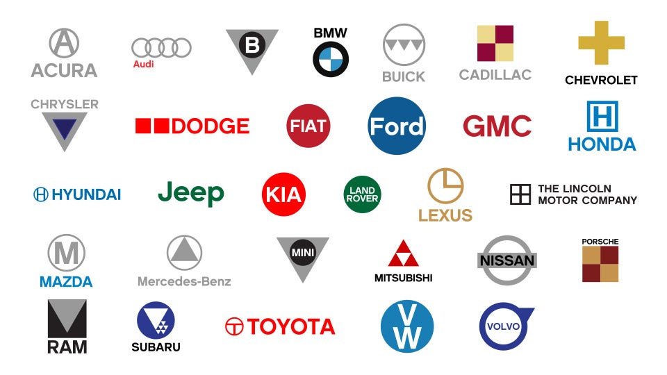
But these super-simple logos got me thinking: what if all the auto marques got a Block/Gap-style makeover, and their logos were distilled down in the most basic forms? So did just that with most of the biggest brands. The results are...mixed. Some logos look almost exactly the same; some are unrecognizable.
Here are the variables I used in drawing up these logos:
- I only used basic geometric shapes
(squares, circles, and triangles, etc.).
- In doing so, I tried where possible to avoid overly-complex
!!!error: Indecipherable SUB-paragraph formatting!!!
style compound shapes.
- I only used solid colors
(red, blue, gold, grey/silver, etc.).
- I used a plain sans serif font if the logo contains text, employing lower-case where appropriate.
- I instituted a 90-second time limit on all logos.
- Where possible, I designed the logo in such a way that it could be described in as few words as possible.
Below is a list of brief explanations (defenses?) of each logo:
Acura:
Silver "A" in a silver ring Audi: A chain of four silver rings
Bentley:
White "B" in a black circle over a silver upside-down triangle
(portraying "wings")
BMW:
Blue and White checker in a black ring Buick: Three upside-down triangles in a silver ring
Cadillac:
Gold and Burgundy checker
(predominant colors in the coat of arms)
Chevrolet:
Gold plus sign
("bowtie"),
black type Chrysler: Dark blue triangle in a silver upside-down triangle
Dodge:
Two red squares
("racing stripes")
Fiat:
White type in a deep red circle Ford: White type in a blue circle
GMC:
Red type
Honda:
Blue "H" in a blue square
Hyundai:
Blue "H" in a blue circle
Jeep:
Green type
Kia:
White type in a bright red circle
Land Rover:
White type in a green circle
Lexus:
Gold "L" in a gold ring
Lincoln Motor Company:
Black plus in a black square
Mazda:
Silver "M" in a silver circle, blue type
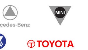
Mercedes-Benz:
Silver triangle in a silver ring
MINI:
White type in a black circle over a silver upside-down triangle
(see Bentley, Chrysler)
Mitsubishi:
3 red triangles, stacked to form a bigger triangle, black type
Nissan:
Black type in a silver rectangle over a silver ring
Porsche:
Deep gold and burgundy checker pattern
(see Cadillac)
RAM:
Silver upside-down triangle in a black square
("ram's head")
, black type
Subaru:
One large white triangle and five smaller white triangles
("Pleiades constellation")
in a dark blue circle
Toyota:
Red "T" in a red ring, red type
VW:
White "V" and "W" vertically stacked in a light blue circle
Volvo:
Dark blue type in a dark blue ring with upside-down dark blue triangle pointing NE
("iron mark")
I realize there are plenty of logos missing from the graphic above (Jaguar, Ferrari, etc.) I plan on giving all of them this treatment. I cannot guarantee any degree of success.
Of course, feel free to post your own ideas. MS Paint (or even Word) is all you need!
 Party-vi
> philaDLJ
10/16/2013 at 11:19 |
|
This is FP material.
 Goshen, formerly Darkcode
> philaDLJ
10/16/2013 at 11:19 |
|
Acura: Bakunin's choice.
 PelicanHazard
> philaDLJ
10/16/2013 at 11:19 |
|
Cadillac and Porsche must now fight to the death. There can only be one! Bentley and MINI, too.
 For Sweden
> philaDLJ
10/16/2013 at 11:20 |
|
Was a pentagon too complex for Chrysler?
 PowderHound
> philaDLJ
10/16/2013 at 11:22 |
|
Can't wait to see the rest of them. Mostly Maserati and Aston Martin
 Bob Loblaw Made Me Make a Phoney Phone Call to Edward Rooney
> philaDLJ
10/16/2013 at 11:24 |
|
Love it. Love it all.
 TheBloody, Oppositelock lives on in our shitposts.
> philaDLJ
10/16/2013 at 11:28 |
|
I'd say Land Rover's current oval is simple enough no?
 philaDLJ
> For Sweden
10/16/2013 at 11:30 |
|
Trust me, I feel bad enough not letting Ford have an oval.
 philaDLJ
> TheBloody, Oppositelock lives on in our shitposts.
10/16/2013 at 11:30 |
|
Probably. :)
 philaDLJ
> philaDLJ
10/16/2013 at 11:32 |
|
A division of Microsoft.
 lonestranger
> philaDLJ
10/16/2013 at 11:32 |
|
Paul Rand would be proud...
... as would Saul Bass:
 Jayhawk Jake
> philaDLJ
10/16/2013 at 11:34 |
|
This is actually better than the bowtie
EDIT: WTF KINJA NOT EVEN CLOSE! Imagine I'm annotating the plus sign
 Gamecat235
> Party-vi
10/16/2013 at 12:07 |
|
A couple of minor edits would make it more suitable (the Audi, Buick, Chrysler explanations are "hidden").
But otherwise I completely agree, this is a really cool design exercise.
 Eric Siedlecki
> philaDLJ
10/16/2013 at 12:10 |
|
Oh god, did I buy a Porsche or a Cadillac?
 Dinger loves his ranger.
> philaDLJ
10/16/2013 at 12:14 |
|

This doesn't change too much.
 Dinger loves his ranger.
> Dinger loves his ranger.
10/16/2013 at 12:15 |
|
Dammit. This was supposed to be the Jeep logo.
 WolfmanJimCBW
> philaDLJ
10/16/2013 at 13:21 |
|
To protect Hyrule we must Evo.
 Naijaflavor, I Love Doritos
> philaDLJ
10/16/2013 at 13:21 |
|
Wasn't Nissan like this back in the 80s/90s?
 deviantpickle
> philaDLJ
10/16/2013 at 13:21 |
|
BLASPHEMY
 TheHondaBro
> philaDLJ
10/16/2013 at 13:21 |
|
Cadillac
 TheHondaBro
> philaDLJ
10/16/2013 at 13:21 |
|
Porsche
 WolfmanJimCBW
> philaDLJ
10/16/2013 at 13:21 |
|

The darkside of Cadillac
 wellthatsdumb
> philaDLJ
10/16/2013 at 13:24 |
|
Honda.
Also known as the Hospital.
 cwgtimkv
> philaDLJ
10/16/2013 at 13:24 |
|
Mother triangle and all her little triangle kids
 Prophet of hoon
> philaDLJ
10/16/2013 at 13:25 |
|
So they're using a phallic symbol to represent a car bought by mostly women and browbeat men? (granted the men showed some restraint by saying "no" to the minivan - so they do have that to comfort themselves).
 Pete Zapardi's Pizza Party
> philaDLJ
10/16/2013 at 13:25 |
|
I approve.

 StewMM
> cwgtimkv
10/16/2013 at 13:25 |
|
I love it
 AMC/Renauledge
> philaDLJ
10/16/2013 at 13:25 |
|

Mama?
 The Gray Adder
> philaDLJ
10/16/2013 at 13:26 |
|
Porsche uses a Wappen that is basically that of the land of Wurttemberg (Weimar-era)with that of the city of Stuttgart superimposed. To distill that, I would suggest going with Stuttgart's colors of yellow and black rather than red and gold.
 April_N_
> Naijaflavor, I Love Doritos
10/16/2013 at 13:27 |
|
Isn't this how it looks today?! O.o
 lt5zr180
> philaDLJ
10/16/2013 at 13:27 |
|
i'll take 8 bit racing games without usage licenses for $1000
 April_N_
> philaDLJ
10/16/2013 at 13:27 |
|
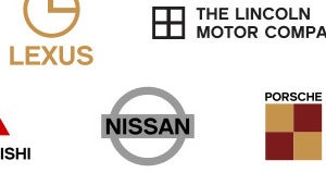
Oh god, it's terrible!
 April_N_
> philaDLJ
10/16/2013 at 13:28 |
|
Funny BMW and Audi seem to stay exactly the same.
 Mathias Rios
> philaDLJ
10/16/2013 at 13:31 |
|
They really butchered Benz. Three lines is pretty simple.
 Jonathan Mok
> philaDLJ
10/16/2013 at 13:31 |
|

Braking Bad.
 Mathias Rios
> philaDLJ
10/16/2013 at 13:32 |
|
They really butchered Benz. Three lines is pretty simple.
 540MPower
> philaDLJ
10/16/2013 at 13:32 |
|

Porsche: Minecraft Edition
 trentoniusm
> philaDLJ
10/16/2013 at 13:32 |
|
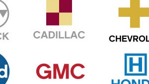
Why would this not remain the bow tie? Is that not simple enough already?
 Mathias Rios
> Mathias Rios
10/16/2013 at 13:32 |
|
But otherwise, awesome!!!
 trentoniusm
> philaDLJ
10/16/2013 at 13:33 |
|
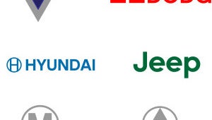
Honda? No this is a Hyundai. Honda has a square around the H where as we are different by having a circle around the H.
 Ninetales
> philaDLJ
10/16/2013 at 13:33 |
|
Zelda?
EDIT: And I pointed at Mitsubishi.. not Acura :/
 pfftballer
> philaDLJ
10/16/2013 at 13:34 |
|
So how did the Cadillac and Porsche logos come out so similar?
 540MPower
> 540MPower
10/16/2013 at 13:34 |
|
I clearly selected the Porsche logo. Damn you annotations!
 zaphodhasanauheart
> philaDLJ
10/16/2013 at 13:34 |
|
I feel like Mini's was fine to start. A circle, with small font that says Mini.
 zaphodhasanauheart
> philaDLJ
10/16/2013 at 13:35 |
|
Honda sends you to hospital? Too much mapping makes me think this.
 prakshash
> philaDLJ
10/16/2013 at 13:35 |
|
Dr. House has already got got this label. Sorry Honda.

 pfftballer
> wellthatsdumb
10/16/2013 at 13:37 |
|
And Helipad.
 zaphodhasanauheart
> philaDLJ
10/16/2013 at 13:37 |
|
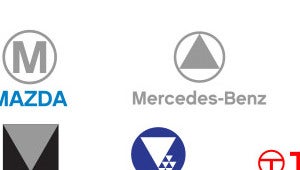
Ram should be flipped over. With a smaller white triangle at top, think mountain.
 You had fordboy357 at "meat tornado"
> philaDLJ
10/16/2013 at 13:37 |
|
I kinda like Ford's logo. Looks like something that would be in a British magazine ad in the early 70's. I could see a groovy chick standing next to a 1600 Escort under than logo.
 zaphodhasanauheart
> philaDLJ
10/16/2013 at 13:38 |
|
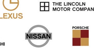
Too much like Cadillac. Make it an upside down triangle, like a shield....like it is now.
 utsman555
> philaDLJ
10/16/2013 at 13:38 |
|
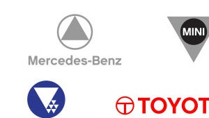
Triangles are not stars.

 zaphodhasanauheart
> philaDLJ
10/16/2013 at 13:38 |
|
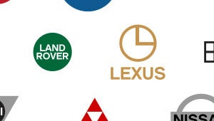
Too clockish, just an L would suffice.
 Michael-Star
> philaDLJ
10/16/2013 at 13:39 |
|
Where is Jaguar?
 RiseVbove
> Mathias Rios
10/16/2013 at 13:39 |
|
The most they should've done is an upside-down T in a circle
 BiffMagnetude
> philaDLJ
10/16/2013 at 13:41 |
|
My first thought was that I liked every one of these better than the companies existing logos. I took a longer second look and agreed with myself.
Nice job.
 gometz
> philaDLJ
10/16/2013 at 13:41 |
|
So there's no way to simplify the BMW symbol any more than it already is eh?
Edit: come on Kinja! Also, Audi looks normal too.
 G8GT364
> philaDLJ
10/16/2013 at 13:41 |
|
Damn it, nevermind.
 Shmalworthington
> philaDLJ
10/16/2013 at 13:42 |
|
3:00?
 Outie5000
> philaDLJ
10/16/2013 at 13:42 |
|
That mazda one is pretty close to their old logo... In fact their old logo could be simpler.
 SasquatchElvis
> Naijaflavor, I Love Doritos
10/16/2013 at 13:43 |
|
Yep, my 99 Maxima had the simple Nissan "Hamburger" on it
 Cheesewhiz
> lonestranger
10/16/2013 at 13:44 |
|
Blue star for you! Those two defined modernism as much as any building, chair or automobile design. Kudos.
 IFTNFS
> wellthatsdumb
10/16/2013 at 13:45 |
|
Or as my ex-girlfriend thought, Harbor.
 505Turbeaux
> philaDLJ
10/16/2013 at 13:46 |
|
proof that simplicity lasts
 Chteelers
> philaDLJ
10/16/2013 at 13:47 |
|
3 o'clock. Time for a Lexus break.
 MaWeiTao
> philaDLJ
10/16/2013 at 13:47 |
|
There are a few interesting ideas in here but not a whole lot of creativity.
I'll be happy when this stupid minimalist flat look finally goes out of style. Not because I dislike the style but because far too many people don't seem to understand that it's not supposed to be so one-dimensional.
I see connections to Paul Rand and Saul Bass, but neither would have approved this junk. There was far more conceptualization behind any of their designs than simply slapping together some basic shapes.
 thxoneonethreeeight
> philaDLJ
10/16/2013 at 13:48 |
|
Instantly reminds me of this.
 Ben C
> philaDLJ
10/16/2013 at 13:48 |
|
Come on. You could have easily drawn three lines for Mercedes instead of one triangle.
And Honda should be silver or red (Type R?). Since when were they blue?
 JoeDapper
> philaDLJ
10/16/2013 at 13:51 |
|

e over i/r
 erikgrad
> philaDLJ
10/16/2013 at 13:51 |
|
...after the inevitable merger of Ford and Microsoft, so Mullaly can lead both?
 frogberg
> pfftballer
10/16/2013 at 13:52 |
|
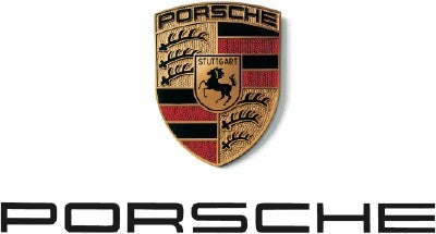
They're both shield/crests with similar checkered color sections
Cadillac crest (just subtract the wreath):
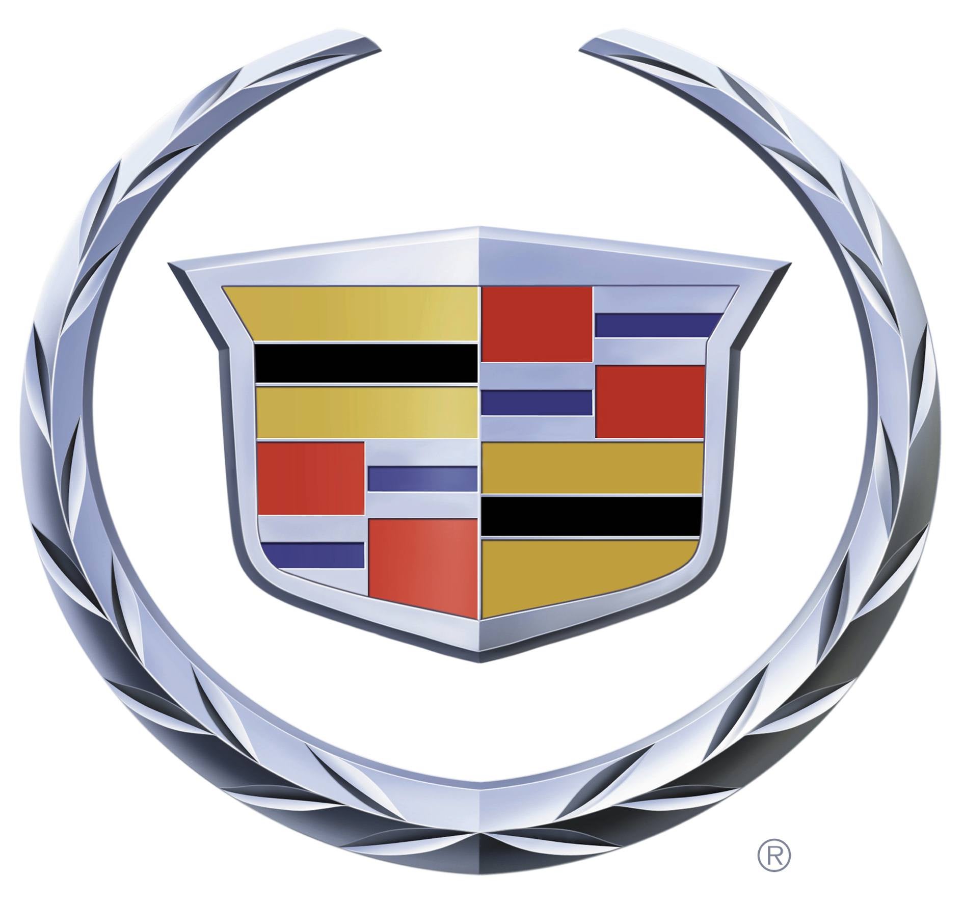
Porsche crest:
 idanon
> philaDLJ
10/16/2013 at 13:53 |
|

I can see him at Apple HQ rn "MOAR GRADIENTS"
 pfftballer
> frogberg
10/16/2013 at 13:54 |
|
Should've at least put a circle around the Caddy one to replace the wreath rather than pretending it didn't exist.
 post_break
> philaDLJ
10/16/2013 at 13:54 |
|
Who else laughed at the Subaru logo? It's like there is one god and all the people are like "I'M WITH THE BIG GUY!"
 calebcondie
> philaDLJ
10/16/2013 at 13:55 |
|
Mazda doesn't really use an M in their emblem though...
 iJakeyB
> philaDLJ
10/16/2013 at 13:56 |
|
I quite like the Lincoln logo. They should adopt that and become the new Saab. Simple, sophisticated, elegant.
 erikgrad
> thxoneonethreeeight
10/16/2013 at 13:56 |
|
I wonder if AMC's logo was actually just pieced together from the surplus logos of other automakers?
 DragginHard
> philaDLJ
10/16/2013 at 13:57 |
|
Deal with it
 Mikeado
> AMC/Renauledge
10/16/2013 at 13:57 |
|
Came here to point that out.
 Bogus Maximus
> philaDLJ
10/16/2013 at 13:57 |
|
The all-new Mitsubishi Triforce.
 DangerRanger
> MaWeiTao
10/16/2013 at 13:57 |
|
I think the idea was to try to show each logo in its basest form. Some of them look worse, some of them look even better. I think they accomplished what they were trying to do.
 bee1000
> lonestranger
10/16/2013 at 13:57 |
|
Uh, no.
 HammerheadFistpunch
> philaDLJ
10/16/2013 at 14:00 |
|
More true than you think
 VashVashVash
> philaDLJ
10/16/2013 at 14:00 |
|
That's nice, but what about Alfa Romeo?
 HammerheadFistpunch
> philaDLJ
10/16/2013 at 14:00 |
|
Now in 8 glorious bits!
 DeeJayQueue
> philaDLJ
10/16/2013 at 14:02 |
|
There's a reason they DON'T do this.
Logos are meant to be symbolic and to evoke some kind of association with the brand or the product. You've reduced them beyond that point. Some of them weren't great logos to begin with, but in a lot of cases they've lost the connection to the brand, and therefore fail as logos. For example, Cadillac Porsche and Buick had complicated crests as logos because their brands are supposed to denote quality, craftsmanship and attention to detail. Reducing them to triangles and squares now sends a message "We're cheap and focused on reducing printing costs." Many of these are just "Make an oval into a circle and switch the font to Helvetica." The H in a square is the common symbol for Hospital, and the M in a circle is a common symbol for Metro. If you're going to put words in a circle, get rid of the circle. You'll see that the logo falls apart because it depends on the typeface.
 Nuno Cardoso
> philaDLJ
10/16/2013 at 14:02 |
|
No Alfa Romeo, no Lancia, no Ferrari, no Maserati, no Lambo. Somebody ate one terrible pizza before going to the drawing board.
 frogberg
> pfftballer
10/16/2013 at 14:03 |
|
Why? Cadillac has already started pretending it doesn't exist: http://wot.motortrend.com/cadillac-loses…
 Group B-raaaaaaaaaap!
> philaDLJ
10/16/2013 at 14:05 |
|
Make it yellow, and we have a winrar!
 troy.overton
> erikgrad
10/16/2013 at 14:05 |
|
You mean like the cars were?
 ezeolla
> calebcondie
10/16/2013 at 14:05 |
|
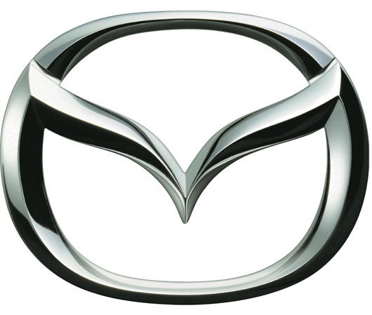
Now look at this
 JSWilson64_g
> philaDLJ
10/16/2013 at 14:07 |
|
What makes a triangle "upside down" or "rightside up"?? It's a geometric shape - quick, draw me an upside down hexagon!
 erikgrad
> trentoniusm
10/16/2013 at 14:07 |
|
Nope, all of them are assembled only with circles, squares, rectangles, and triangles. (and letters) - though technically, the ends of the bow tie are could be considered triangular

 FlyingV
> troy.overton
10/16/2013 at 14:08 |
|
OH SNAP Y'ALL!!!
 DFW
> Chteelers
10/16/2013 at 14:08 |
|
More like 75% (or 25%)
 Chteelers
> DFW
10/16/2013 at 14:11 |
|
Lexus. We are 75% as good.
 FlyingV
> ezeolla
10/16/2013 at 14:12 |
|
All I see is this:
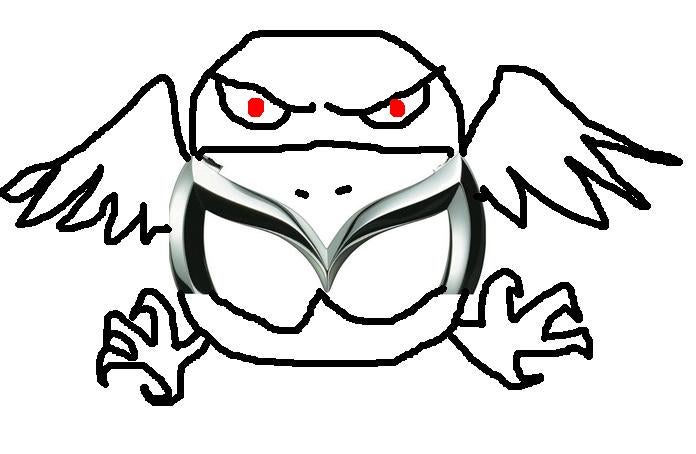
 DMCVegas
> philaDLJ
10/16/2013 at 14:13 |
|
So the only difference between a Caddy and a Porsche is the darkness?
 Arcane
> philaDLJ
10/16/2013 at 14:13 |
|
The American Yellow Cross. Schedule a Urine Donation today in a Urine Collection Location near you.
 GoldfishDepartment
> philaDLJ
10/16/2013 at 14:15 |
|
Actually, the Mazda logo is a seagull - this is the meaning of the word "mazda" in Japanese.
 GoldfishDepartment
> philaDLJ
10/16/2013 at 14:16 |
|
You've ruined it. in the original logo you can see the letters T, O, Y, A - so it contains all you need to spell TOYOTA